
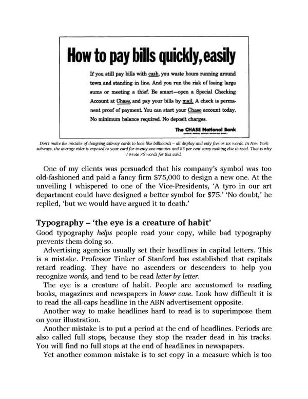
Don’t make the mistake of designing subway cards to look like billboards – all display and only five or six words. In New York subways, the average rider is exposed to your card for twenty-one minutes and 85 per cent carry nothing else to read. That is why I wrote 76 words for this card. One of my clients was persuaded that his company’s symbol was too old-fashioned and paid a fancy firm $75,000 to design a new one. At the unveiling I whispered to one of the Vice-Presidents, ‘A tyro in our art department could have designed a better symbol for $75.’ ‘No doubt,’ he replied, ‘but we would have argued it to death.’ Typography – ‘the eye is a creature of habit’ Good typography helps people read your copy, while bad typography prevents them doing so. Advertising agencies usually set their headlines in capital letters. This is a mistake. Professor Tinker of Stanford has established that capitals retard reading. They have no ascenders or descenders to help you recognize words, and tend to be read letter by letter. The eye is a creature of habit. People are accustomed to reading books, magazines and newspapers in lower case. Look how difficult it is to read the all-caps headline in the ABN advertisement opposite. Another way to make headlines hard to read is to superimpose them on your illustration. Another mistake is to put a period at the end of headlines. Periods are also called full stops, because they stop the reader dead in his tracks. You will find no full stops at the end of headlines in newspapers. Yet another common mistake is to set copy in a measure which is too
 Ogilvy on Advertising Page 139 Page 141