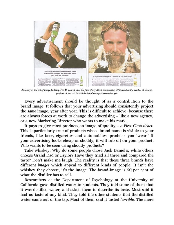
An essay in the art of image-building. For 18 years I used the face of my client Commander Whitehead as the symbol of his own product. It worked to beat the band on a peppercorn budget. Every advertisement should be thought of as a contribution to the brand image. It follows that your advertising should consistently project the same image, year after year. This is difficult to achieve, because there are always forces at work to change the advertising – like a new agency, or a new Marketing Director who wants to make his mark. It pays to give most products an image of quality – a First Class ticket. This is particularly true of products whose brand-name is visible to your friends, like beer, cigarettes and automobiles: products you ‘wear.’ If your advertising looks cheap or shoddy, it will rub off on your product. Who wants to be seen using shoddy products? Take whiskey. Why do some people chose Jack Daniel’s, while others choose Grand Dad or Taylor? Have they tried all three and compared the taste? Don’t make me laugh. The reality is that these three brands have different images which appeal to different kinds of people. It isn’t the whiskey they choose, it’s the image. The brand image is 90 per cent of what the distiller has to sell. Researchers at the Department of Psychology at the University of California gave distilled water to students. They told some of them that it was distilled water, and asked them to describe its taste. Most said it had no taste of any kind. They told the other students that the distilled water came out of the tap. Most of them said it tasted horrible. The mere
 Ogilvy on Advertising Page 18 Page 20