
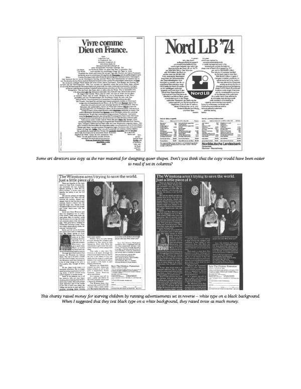
Some art directors use copy as the raw material for designing queer shapes. Don’t you think that the copy would have been easier to read if set in columns? This charity raised money for starving children by running advertisements set in reverse – white type on a black background. When I suggested that they test black type on a white background, they raised twice as much money.
 Ogilvy on Advertising Page 146 Page 148