
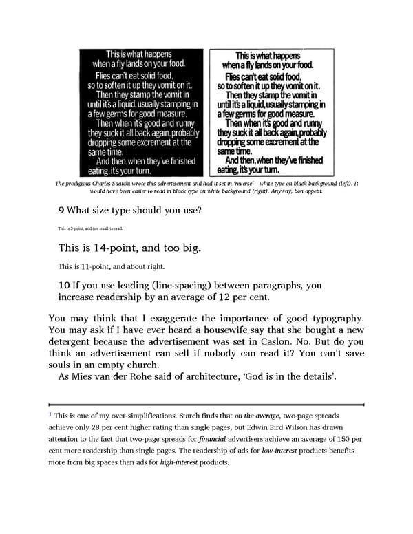
The prodigious Charles Saatchi wrote this advertisement and had it set in ‘reverse’ – white type on black background (left). It would have been easier to read in black type on white background (right). Anyway, bon appetit. 9 What size type should you use? This is 5-point, and too small to read. This is 14-point, and too big. This is 11-point, and about right. 10 If you use leading (line-spacing) between paragraphs, you increase readership by an average of 12 per cent. You may think that I exaggerate the importance of good typography. You may ask if I have ever heard a housewife say that she bought a new detergent because the advertisement was set in Caslon. No. But do you think an advertisement can sell if nobody can read it? You can’t save souls in an empty church. As Mies van der Rohe said of architecture, ‘God is in the details’. 1 This is one of my over-simplifications. Starch finds that on the average, two-page spreads achieve only 28 per cent higher rating than single pages, but Edwin Bird Wilson has drawn attention to the fact that two-page spreads for financial advertisers achieve an average of 150 per cent more readership than single pages. The readership of ads for low-interest products benefits more from big spaces than ads for high-interest products.
 Ogilvy on Advertising Page 147 Page 149