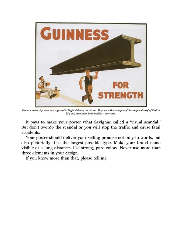
One in a series of posters that appeared in England during the thirties. They made Guinness part of the warp and woof of English life, and have never been excelled – anywhere. It pays to make your poster what Savignac called a ‘visual scandal.’ But don’t overdo the scandal or you will stop the traffic and cause fatal accidents. Your poster should deliver your selling promise not only in words, but also pictorially. Use the largest possible type. Make your brand name visible at a long distance. Use strong, pure colors. Never use more than three elements in your design. If you know more than that, please tell me.
 Ogilvy on Advertising Page 137 Page 139