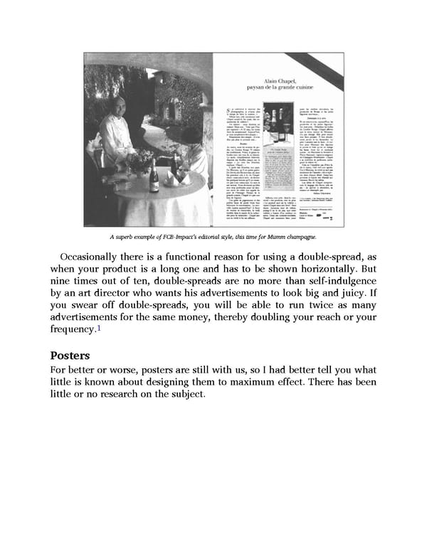
A superb example of FCB-Impact’s editorial style, this time for Mumm champagne. Occasionally there is a functional reason for using a double-spread, as when your product is a long one and has to be shown horizontally. But nine times out of ten, double-spreads are no more than self-indulgence by an art director who wants his advertisements to look big and juicy. If you swear off double-spreads, you will be able to run twice as many advertisements for the same money, thereby doubling your reach or your 1 frequency. Posters For better or worse, posters are still with us, so I had better tell you what little is known about designing them to maximum effect. There has been little or no research on the subject.
 Ogilvy on Advertising Page 136 Page 138