
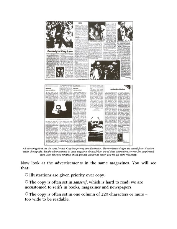
All news magazines use the same format. Copy has priority over illustration. Three columns of type, set in serif faces. Captions under photographs. But the advertisements in these magazines do not follow any of these conventions, so very few people read them. Next time you construct an ad, pretend you are an editor; you will get more readership. Now look at the advertisements in the same magazines. You will see that: Illustrations are given priority over copy. The copy is often set in sanserif, which is hard to read; we are accustomed to serifs in books, magazines and newspapers. The copy is often set in one column of 120 characters or more – too wide to be readable.
 Ogilvy on Advertising Page 131 Page 133