
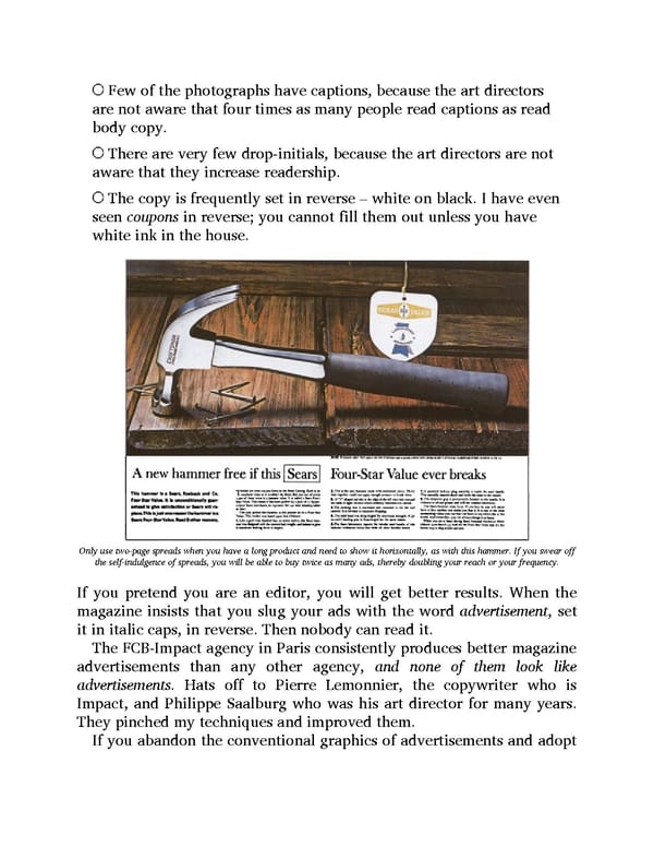
Few of the photographs have captions, because the art directors are not aware that four times as many people read captions as read body copy. There are very few drop-initials, because the art directors are not aware that they increase readership. The copy is frequently set in reverse – white on black. I have even seen coupons in reverse; you cannot fill them out unless you have white ink in the house. Only use two-page spreads when you have a long product and need to show it horizontally, as with this hammer. If you swear off the self-indulgence of spreads, you will be able to buy twice as many ads, thereby doubling your reach or your frequency. If you pretend you are an editor, you will get better results. When the magazine insists that you slug your ads with the word advertisement, set it in italic caps, in reverse. Then nobody can read it. The FCB-Impact agency in Paris consistently produces better magazine advertisements than any other agency, and none of them look like advertisements. Hats off to Pierre Lemonnier, the copywriter who is Impact, and Philippe Saalburg who was his art director for many years. They pinched my techniques and improved them. If you abandon the conventional graphics of advertisements and adopt
 Ogilvy on Advertising Page 132 Page 134