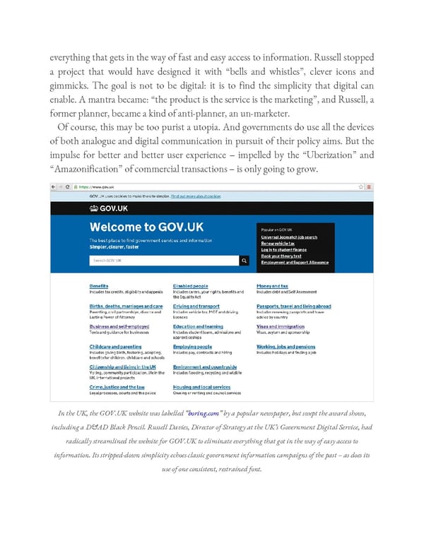
everything that gets in the way of fast and easy access to information. Russell stopped a project that would have designed it with “bells and whistles”, clever icons and gimmicks. The goal is not to be digital: it is to find the simplicity that digital can enable. A mantra became: “the product is the service is the marketing”, and Russell, a former planner, became a kind of anti-planner, an un-marketer. Of course, this may be too purist a utopia. And governments do use all the devices of both analogue and digital communication in pursuit of their policy aims. But the impulse for better and better user experience – impelled by the “Uberization” and “Amazonification” of commercial transactions – is only going to grow. In the UK, the GOV.UK website was labelled “boring.com” by a popular newspaper, but swept the award shows, including a D&AD Black Pencil. Russell Davies, Director of Strategy at the UK’s Government Digital Service, had radically streamlined the website for GOV.UK to eliminate everything that got in the way of easy access to information. Its stripped-down simplicity echoes classic government information campaigns of the past – as does its use of one consistent, restrained font.
 Ogilvy on Advertising in the Digital Age Page 336 Page 338